Learning Diary
Student Number: S14125063
Name: Hilda Walusimo
Week One: Visual Design in the Wild
Student Number: S14125063
Name: Hilda Walusimo
Week One: Visual Design in the Wild
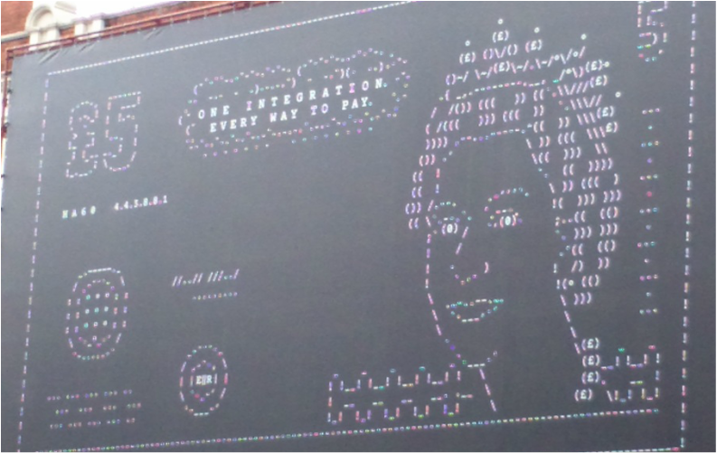
For the first task, I went to Shoreditch in London to research visual designs that looked appealing and of interest.
The main colours used within this design are black, white, pink and spots of green, red, yellow, etc. It was the spots of other colours used within this design that also made me notice this design as it made it stand out more as opposed to if the main colours used were just black, white and pink.
What caught my attention about this particular design was the computer programming interpretation of the £5 note; I felt it was a very creative take on the British Money. The computer programming interpretation alongside the fact that it is of the £5 note could represent the digitalization of money and how technological advances have now taken over most traditional ways of doing things even down to managing our money.
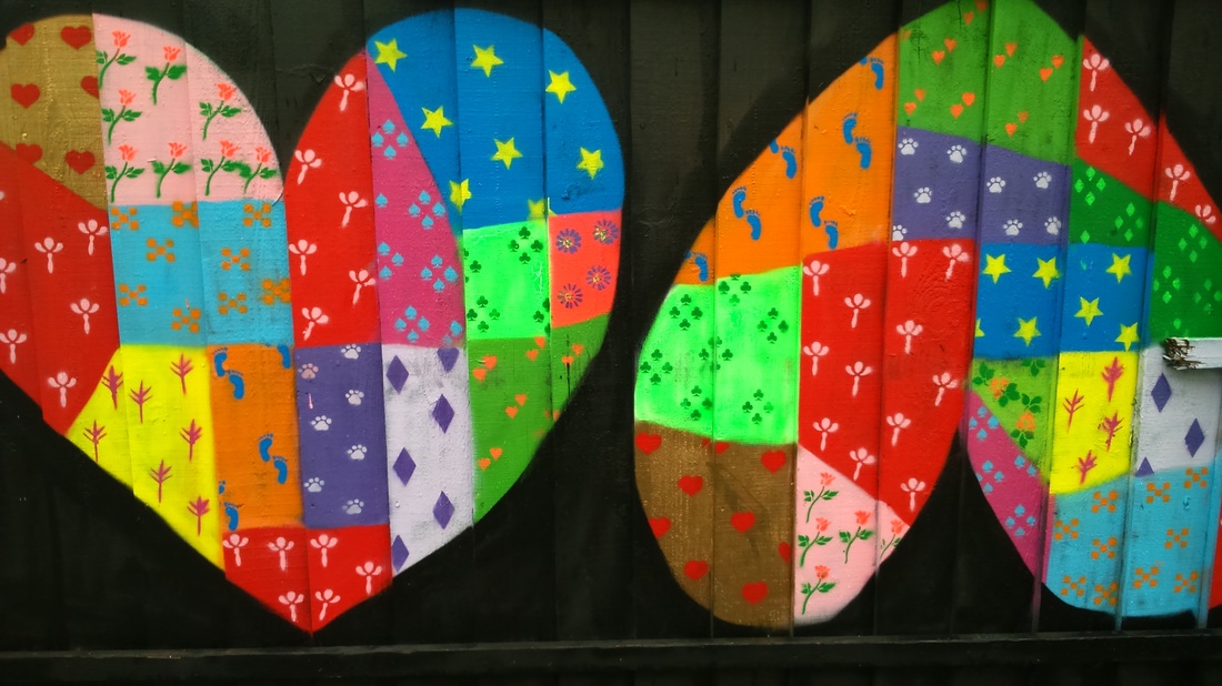
The second piece of street art that I found and was interesting to me was this piece which are two love hearts- one the right way up as we know it and one that is upside down.
The main reason that this piece stood out to me was because of the colours. The main colours used are the black background and then various bright colours such as red, yellow, orange, blue, purple, pink, green, lilac with some areas having duller colours such as brown. When I first saw this piece, the vibrancy of the artwork caught my attention but as well as this there was a 60s hippy vibe that it gave me. The fact that the two chosen shapes were hearts as well which could be representative of peace and love also add to this 60s hippy vibe and the message that was embedded in those times. I thought that the vibrancy of the colours and the darkness of the black background complemented each other very well and it could be a reflection of the contrast between the peace and love & also the coldness and hatred in this world making this a very bold statement piece of street art.
The main reason that this piece stood out to me was because of the colours. The main colours used are the black background and then various bright colours such as red, yellow, orange, blue, purple, pink, green, lilac with some areas having duller colours such as brown. When I first saw this piece, the vibrancy of the artwork caught my attention but as well as this there was a 60s hippy vibe that it gave me. The fact that the two chosen shapes were hearts as well which could be representative of peace and love also add to this 60s hippy vibe and the message that was embedded in those times. I thought that the vibrancy of the colours and the darkness of the black background complemented each other very well and it could be a reflection of the contrast between the peace and love & also the coldness and hatred in this world making this a very bold statement piece of street art.
Week Two: Typography in the Wild

I also went in Shoreditch to see the different examples of typographies itself and also examples of typographies within visual design. An example I found was this logo for what appears to be a PR company called ‘Tea & Cake PR”. The typography used for the PR company is very simple, quite chic, readable yet it has a very classic look that is quite reminiscent of the British 60/70s era, this in turn allows it to stand out and look more interesting despite it being a small logo.
In addition, the tracking in ‘Tea”, “Cake” and “PR” are fairly closed yet consistent and for the leading, the “&” sign used within the logo is not aligned with the word “Tea” and is placed above the letter e in ‘Cake’ however other than that the leading is close together and consistent. Also, kerning was also applied to the individual letters which I assume is keep the logo together and make it look more compact due to the small location in which it was placed.
In addition, the tracking in ‘Tea”, “Cake” and “PR” are fairly closed yet consistent and for the leading, the “&” sign used within the logo is not aligned with the word “Tea” and is placed above the letter e in ‘Cake’ however other than that the leading is close together and consistent. Also, kerning was also applied to the individual letters which I assume is keep the logo together and make it look more compact due to the small location in which it was placed.
Business Card Task
In addition to learning about types and typography, I then put what I had learnt into practice by designing a business card for myself that was solely based on types and typography alone. Before I went about designing my own, I decided to look at 2 different examples of business cards just so I could get an idea on how to create my own. These were the two business cards- one belonging to a personal friend and one belonging to employer from my former work experience:
In addition to learning about types and typography, I then put what I had learnt into practice by designing a business card for myself that was solely based on types and typography alone. Before I went about designing my own, I decided to look at 2 different examples of business cards just so I could get an idea on how to create my own. These were the two business cards- one belonging to a personal friend and one belonging to employer from my former work experience:
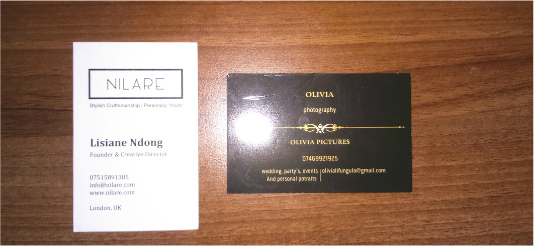
Drawing inspiration from these two examples, then came time to making my decisions about my business card and what I wanted it to look like. I decided that I wanted it to simple, clear and professional looking so for that reason I decided that I did not want any bright, funky colours. I drew out a rough draft of my business just so I knew what information I am going to include on it and to give me a rough guide of where all the information I am going to include will be positioned on my card:
After drawing up my basic design of what I wanted my business card to look like I then went ahead and made my card. As stated, I wanted a business card that had a simple yet clean and professional look. The fonts used were Times New Roman for my occupation stated, Georgia for my name and Arial for my contact details- all these fonts were purposely chosen because they are not too fancy or too busy and it makes the information on my card easy for people to read. All the information displayed is justified in the middle, making everything the centre of attention thus making it the main focus.
Week 3: Shape & Form
Logo Case Studies
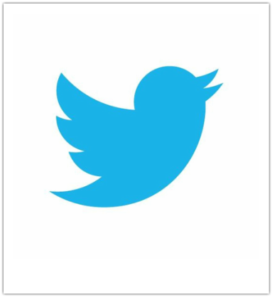
The case study I have chosen to look at is the logo for social media networking site, Twitter. There is no font used, as the logo does not consist of any words. Moreover, the logo is a white square with a blue bird in the centre which cleverly shows the intended purpose of Twitter and is also a play on how Twitter users communicate with one another and also the sounds that birds make, ‘tweeting’ which makes the logo very memorable and clear. The colours used are white and blue which is simple and easy on the eye, also these colours are very reminiscent of nature as could represent clouds and the sky which ties along very well with the bird being symbolic for Twitter.
This logo is very successful as it is very recognizable- when people see the logo; they know it is for Twitter.
This logo is very successful as it is very recognizable- when people see the logo; they know it is for Twitter.
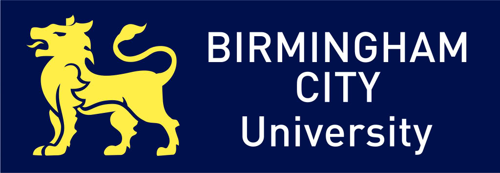
The second case study that I have chosen to look at is the logo for Birmingham City University.
There are not many shapes used within the logo but there is an image of a lion and font with the words ‘Birmingham City University’ which one could say is an iconic sign as when you see the logo you know what it represents.
The main colours used are blue, white and yellow. I believe that the white is used purely for the readability factor and the Times New Roman font emphasises this, however that alongside the blue used gives the logo a clever take on it’s version of Union Jack flag except yellow is used instead of red- this could represent the fact that Birmingham and Birmingham City University is a proudly British institution but as well as that- a multicultural university, just as Great Britain as a whole is perceived to be that way too.
The lion is usually a symbol of pride, strength and royalty therefore one could say that the use of the lion on the BCU logo could reflect the strength of the students that make up the university and also the university pride that comes from BCU.
This is a successful design because it is clear, simple, very memorable and recognisable therefore one would be able to know just from viewing the logo which university institution this logo is for.
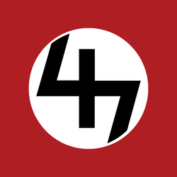
The final case study that I have chosen to look at is one of the two logos for Pro Era, a current young rap collective from New York- this logo is what the rap collective call the ‘47’ sticker.
The main colours used within this logo are red, black and white- they stand out, they are clear to see and it makes the logo one that will be memorable.
Pro Era is somewhat of a controversial rap group due to the topics in which they speak on in their music and their logo successfully captures that. For example, pertaining to this particular logo in earlier interviews the group have stated that this logo that they created actually got them in a lot of trouble as it is very reminiscent of the Swastika symbol- and that they mainly got in trouble for it as they lived in a Jewish neighbourhood. One of the group’s members, Capital Steez, was even put under investigation by the NYPD because of the symbols associations with hate crime. However, the group have also stated that they wanted to cause controversy and wanted to play on people’s ignorance purposely which suggests that this logo is not only a mere symbol of their brand as a rap collective but also a reflection of rebellion.
This logo is successful because the group evidently wanted to cause controversy not only in their music but with their brand as well- this logo successfully fulfills that aim.
Week 4: Colour and Image
Physical Album Cover Redesign
Before coming to a decision of which album cover I should redesign, I made a little list of the favourite albums covers that I could remember and this was I came up with:
-Aaliyah: Aaliyah
-Nas: Untitled
-Mariah Carey: Butterfly
-Katy B: Little Red
-Joey Bada$$: B4. DA. $$
-Hayley Cassidy: Stripped
-Kanye West: College Dropout
-Pro Era: The 47 Shift
-Janet Jackson: Unbreakable
-Nas: Illmatic
-TLC: Crazy Sexy Cool
I then decided that Katy B's 'Little Red' album cover would be the cover that I'd redesign as I there's more interesting things I could do with that cover.
Colour Case Studies

The colour case study that I decided to look at was another one of Pro Era’s logos. The colours used within this logo are green, black and red. The colour of green used is a bit brighter and more vibrant than the Khaki green used in army clothing therefore Pro Era could represent an army ready to fight for the things they believe in as a collective which fits along with the black and red- which could represent blood also suggestive of the army.
As mentioned previously, Pro Era are known to be controversial. With this logo in particularly, for example, there are eyes in the letter ‘R’ of the words ‘Pro’ and ‘Era’ which consequently led to rumours of the group being members of the illuminati and this theme of eyes is also reflected through the words pro era being placed in oval shapes which have been positioned to look like eyes- reminiscent to that of an owl.
The rap group are known to speak out about topics such as the current state of America in terms of police brutality, the government, etc. therefore is could be suggested that the theme of eyes is a spin on and represents the current ‘all-seeing’ corrupt Government.
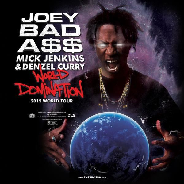
The second colour case study that I will be looking at is one that depicts a music event poster- more specifically a poster for the tour of Hip-Hop artist Joey Bada$$.
The colours used within this poster are black, white, brown, blue, purple and red- the red being specifically used in 'World Domination', this is the name of the tour being advertised therefore using red helps the name to stand out the most in the poster. The other colours used in the colour scheme are used together intentionally to give the poster an outer space type of feel which goes with the name of the tour and represents the artist wanting to take over the world therefore everything together goes matches the artist's aims.
In addition, the colour scheme also gives the poster a darker feel which is a vibe typically associated with the hip hop music genre. Joey's facial expressions and hand gestures alongside the colour scheme used, however, represents the fact that the World Domination tour will be an out of this world experience- again, matching the name of the tour.
Photographic Case Studies
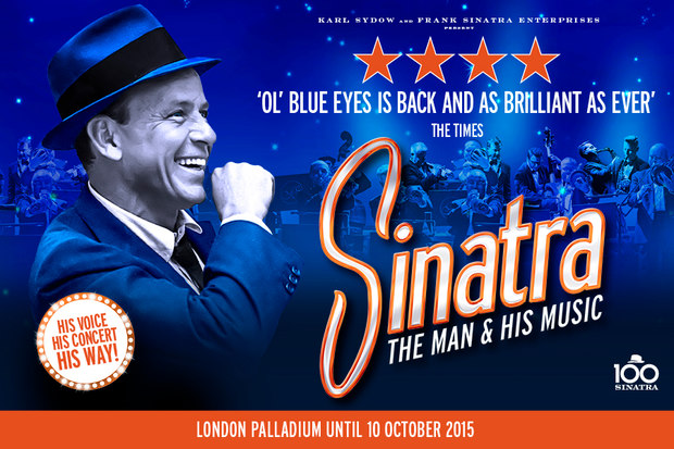
The first photographic case study I have chosen depicts the iconic singer Frank Sinatra in a promotional poster for a theatre production based on the singer’s life.
The poster insinuates that there will obviously be live music featured in the production and this is done through the picture of the live band which is placed in the background. The picture of the live band appears to be faded and smaller than the image used of Sinatra himself thus indicating that the live band are not that important and that Sinatra is the main focus merely because this is a production based on the singer’s life.
In addition, the poster conveys that the play will include good and classic Sinatra music as well as music by other artists from his era. It also insinuates that the audience will have a good time and leave the theatre feeling happy because Sinatra and his music will have them feeling that way- the designer communicates this by using a picture of Sinatra where he appears to be feeling good and looking happy. The fact that the play has been given 4 stars and been called ‘brilliant as ever’ by The Times which is stated within the poster also indicates that this is a must see for audiences.
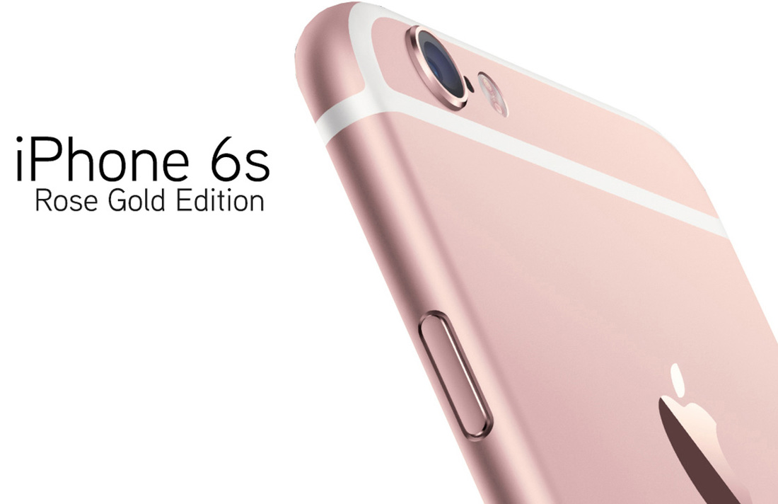
The second photographic case study chosen depicts an advert for the latest IPhone 6s phone- the rose gold edition. The advert has a feminine, lady-like feel to it which is depicted through the light colours used within the advert such as the white/cream background and the pink of the phone. The advert states the model of the phone so that the audience know which phone it is- the ‘rose gold edition’ element in the advert suggests that this phone is new and that is exclusive. The design of the advert is very simple, clean and crisp giving the advert a chic touch. In addition, there is a close-up of the back of the IPhone- this is perhaps to convey and put emphasis on the luxury and high quality of not only the phone itself but also the Apple brand as a whole.
Week 6: Magazine in a Day
For the magazine in a day task, as a designer I was given a brief for a new magazine which would be called 'Trashion'. Below is the brief for the magazine which I had to follow:
"-Trashion is a fashion and culture magazine aimed at an alternative scene.
-At Trashion we love creativity, quirky and handmade crafts, thrift finds, customised clothes and vintage fashion.
-The 'make do and mend' culture is booming and becoming cool. Trashion embraces this new wave of stylish cool.
-Our target audience is mostly female, with a core audience from 18-30. Trashion also appeals to more mature teenage girls. Our readers are university students or graduates, with a keen fashion eye, and an interest in arts and culture. They are likely to spend a lot of the disposable income on clothes and accessories as well as gigs and club nights."
Keeping the design brief in mind, I researched different fashion magazines from Vogue to Elle Magazine before I set out to do a draft design for my own front cover and to give me an idea of what fashion magazines include on their front covers and what they look like typically. Two covers that caught my attention where the covers of Elle Magazine from Bulgaria and Spanish Vogue which featured Rihanna and Jennifer Lopez on their covers:
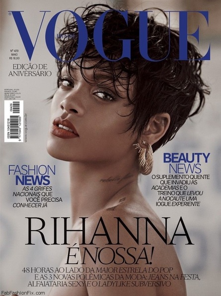
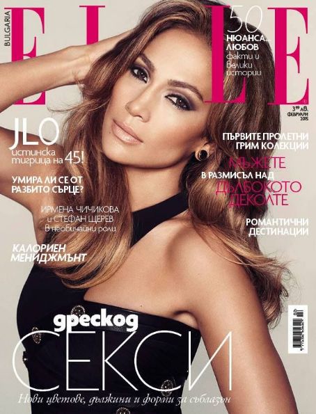
I decided that I would somewhat adapt the house styles of these two magazines to my own design for my adaptation of the 'Trashion' front cover.
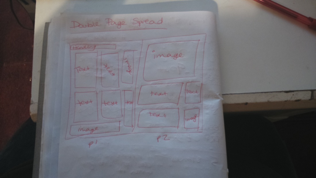
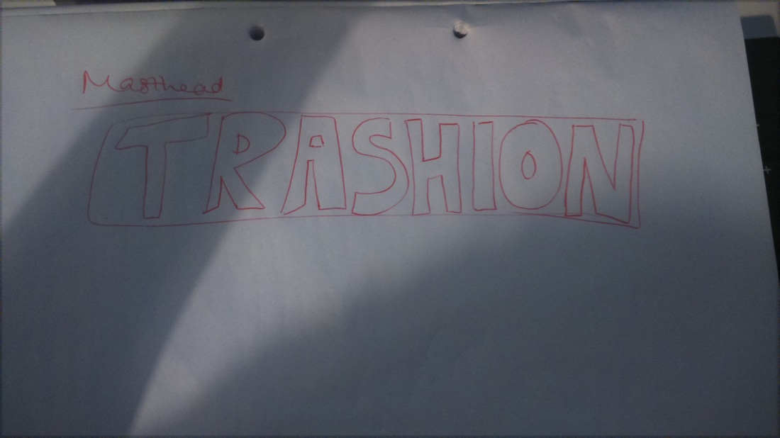
I began by drawing out the masthead for the magazine and doing various sketches of the layout for the content within the magazine as well just as a brief guideline which would be changeable later, my sketches are below:
I began by drawing out the masthead for the magazine and doing various sketches of the layout for the content within the magazine as well just as a brief guideline which would be changeable later, my sketches are below:
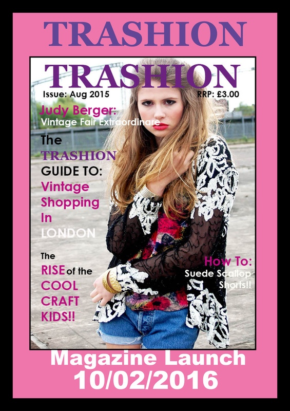
Here is a very brief description of what I will be using for my house style:
HOUSE STYLE
TYPOGRAPHY – Georgia Bold and Century Gothic Bold.
TYPE SCALING – From 25 to 48% taking into consideration the tracking of the type.
COLOUR PALETTE – black, white, PANTONE MAGENTA P80-16C, C=65 M=100 Y=0 K=13.
FURNITURE STYLE – Images to wrap around the text.
THE PROCESS
HOUSE STYLE
TYPOGRAPHY – Georgia Bold and Century Gothic Bold.
TYPE SCALING – From 25 to 48% taking into consideration the tracking of the type.
COLOUR PALETTE – black, white, PANTONE MAGENTA P80-16C, C=65 M=100 Y=0 K=13.
FURNITURE STYLE – Images to wrap around the text.
THE PROCESS
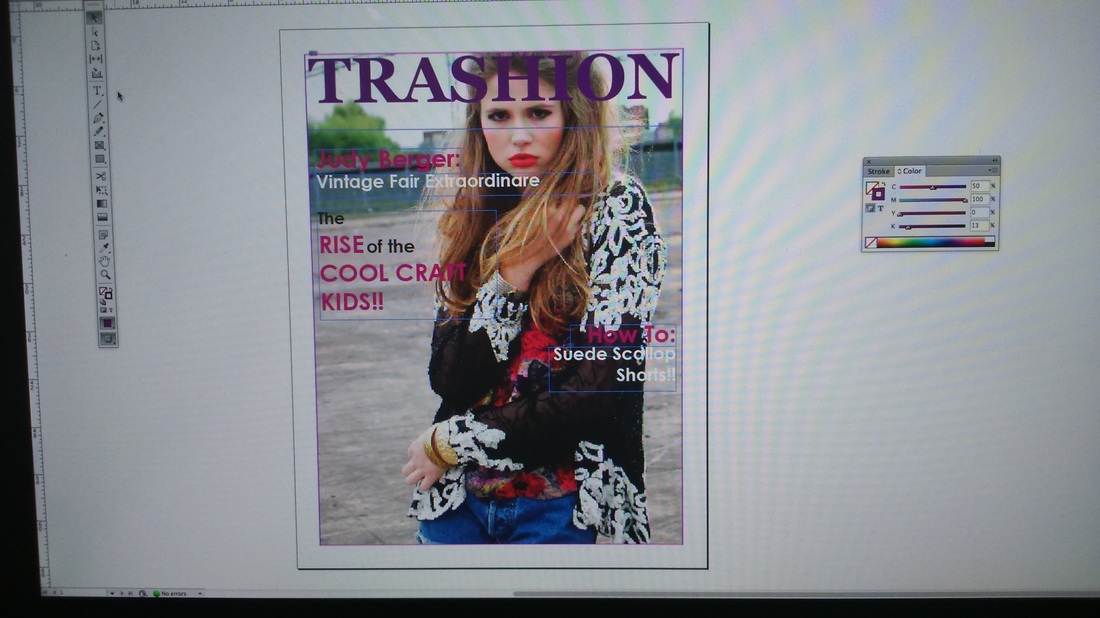
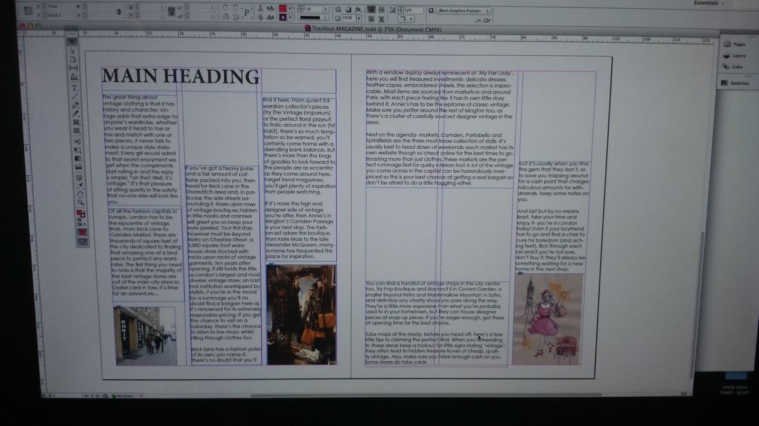
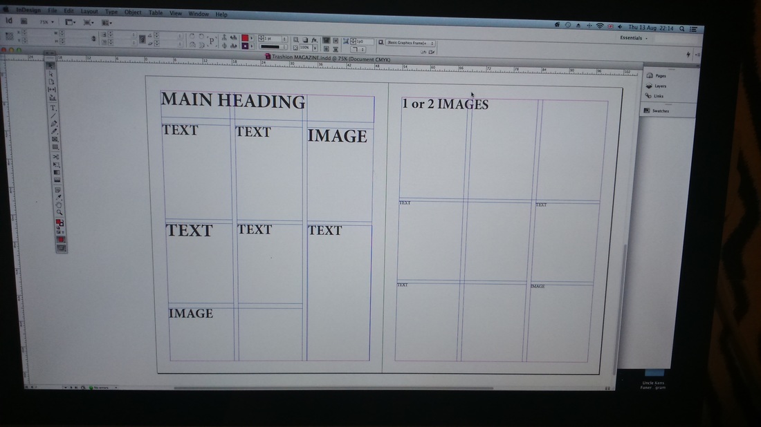
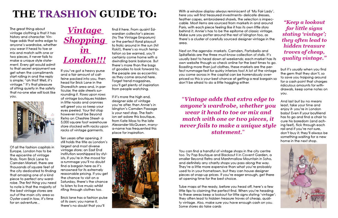
The images above are of the different stages that I was at in creating my Trashion front cover and an example of the a double page spread from the articles which were provided. As I was doing the both the front cover and article, it was a case of me experimenting with different colours, sizes to make certain words stand out more than others until I the front cover and article looked how I wanted it to look and looked appealing to its target audience.
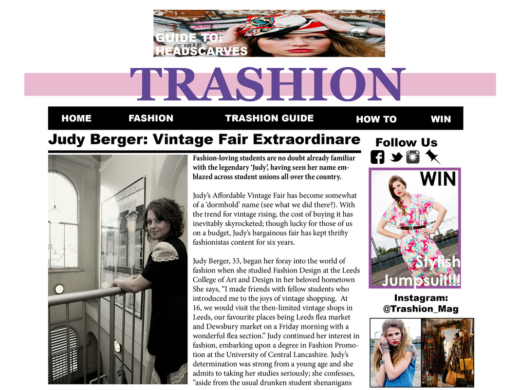
FINAL PRODUCT
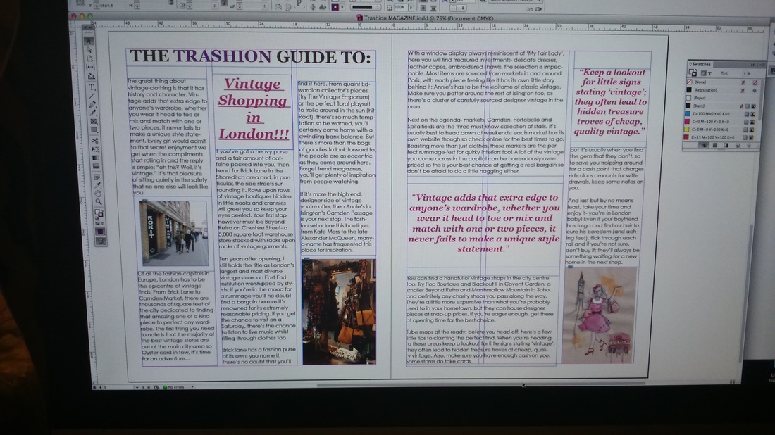
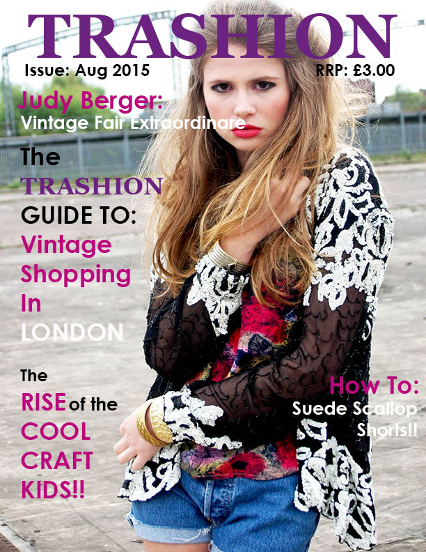
Below is the final product of my Trashion front cover and an example of what an article would look like within the magazine (although it would differ from article to article, depending on what the content would be)
FINAL PRODUCT
Below is the final product of my Trashion front cover and an example of what an article would look like within the magazine (although it would differ from article to article, depending on what the content would be)
Week 7: Multimedia in a Day
The next task was to create a mock up website of Trashion magazine that would compliment the print version. In addition to this, I also had create mock ups of what the website would look like on the iPhone & iPad.
Website Mock-Up Design
For the website, I have created two mock-up designs:
-Homepage
-An example which would give an indication as to what an article on the webpage would look like
Below shows the different processes which thus led to my final product:
And below is what I thought would be the final product:
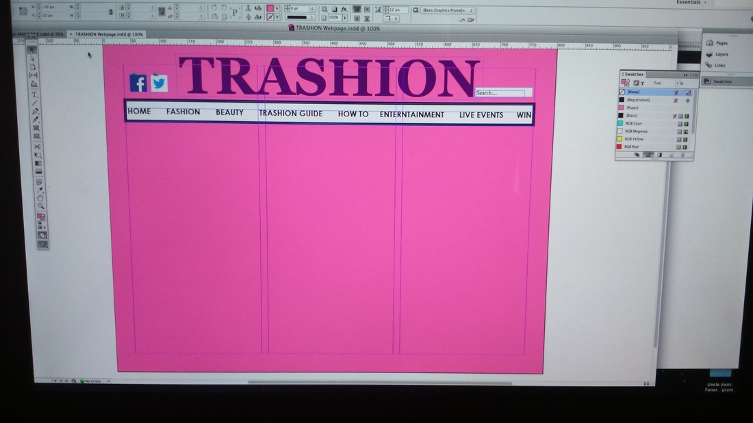
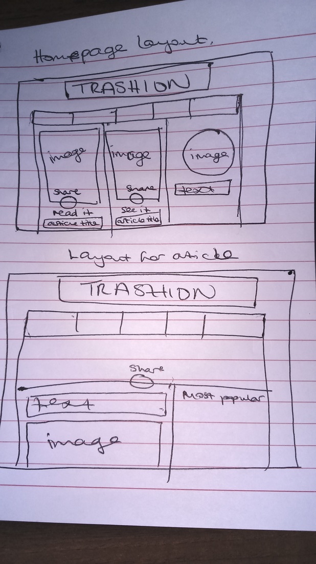
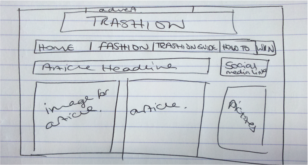
However, after looking at different examples of actual webpages of different magazines and looking at the work of previous students I realised that my webpage didn't look very structure or professional. There was also a lot of blank spaces that could have been filled thus making my webpage look very bland. For this reason I decided to go through the website mock-up design process again and totally redesign it. After doing my research, I began by drawing some basic sketches of what I wanted the homepage of the website and the page with my exemplar article to look like:
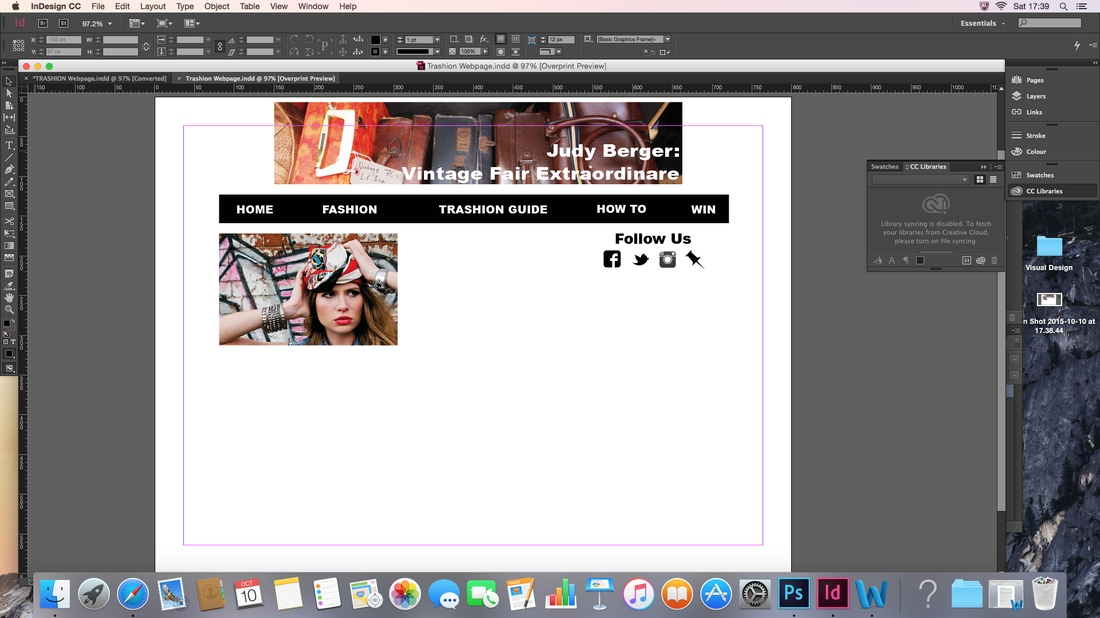
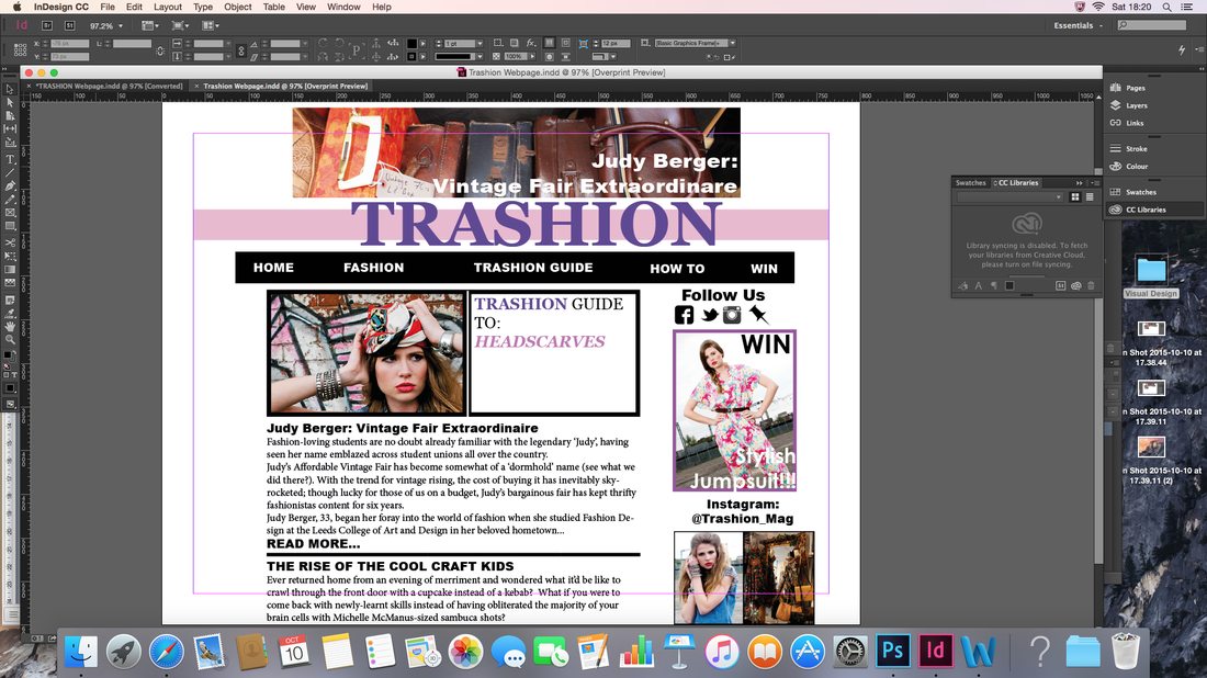
Here are the screenshots which show the process of me creating the webpage on InDesign:
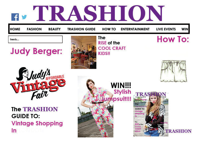
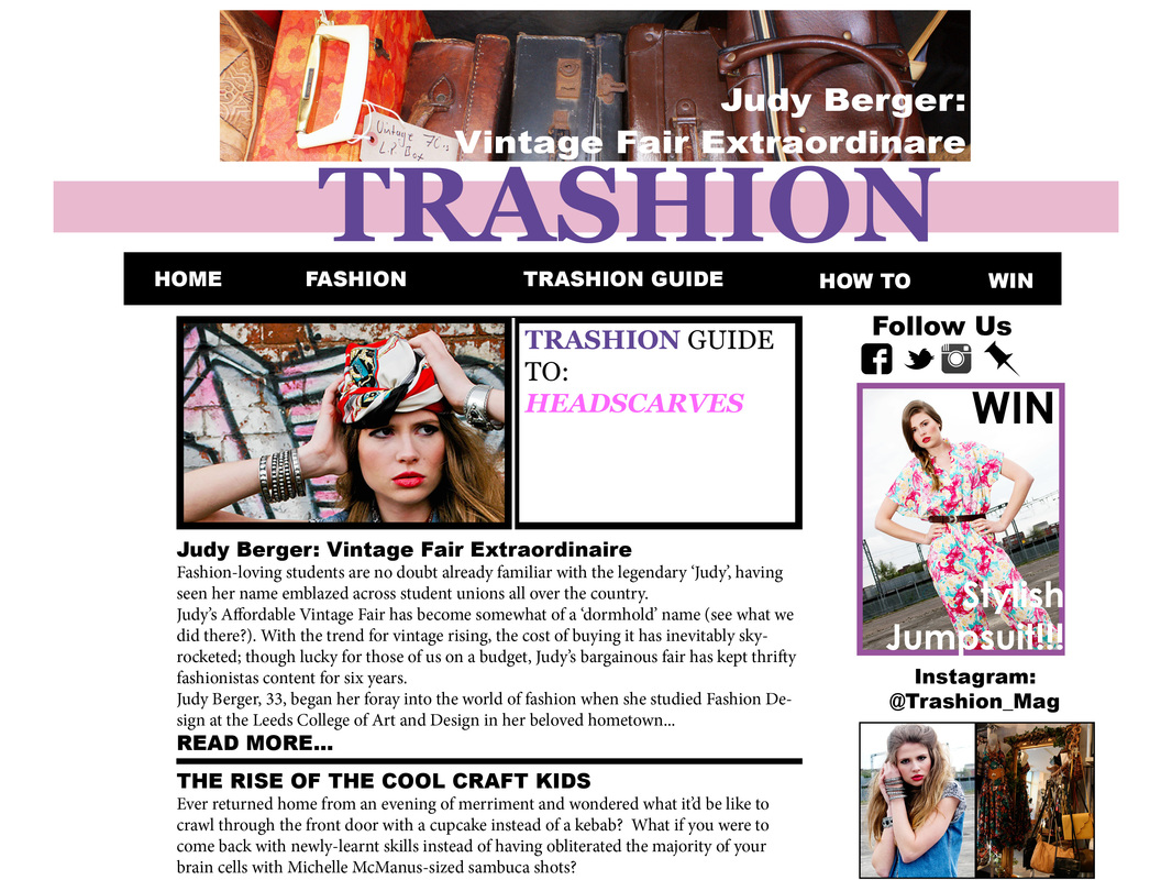
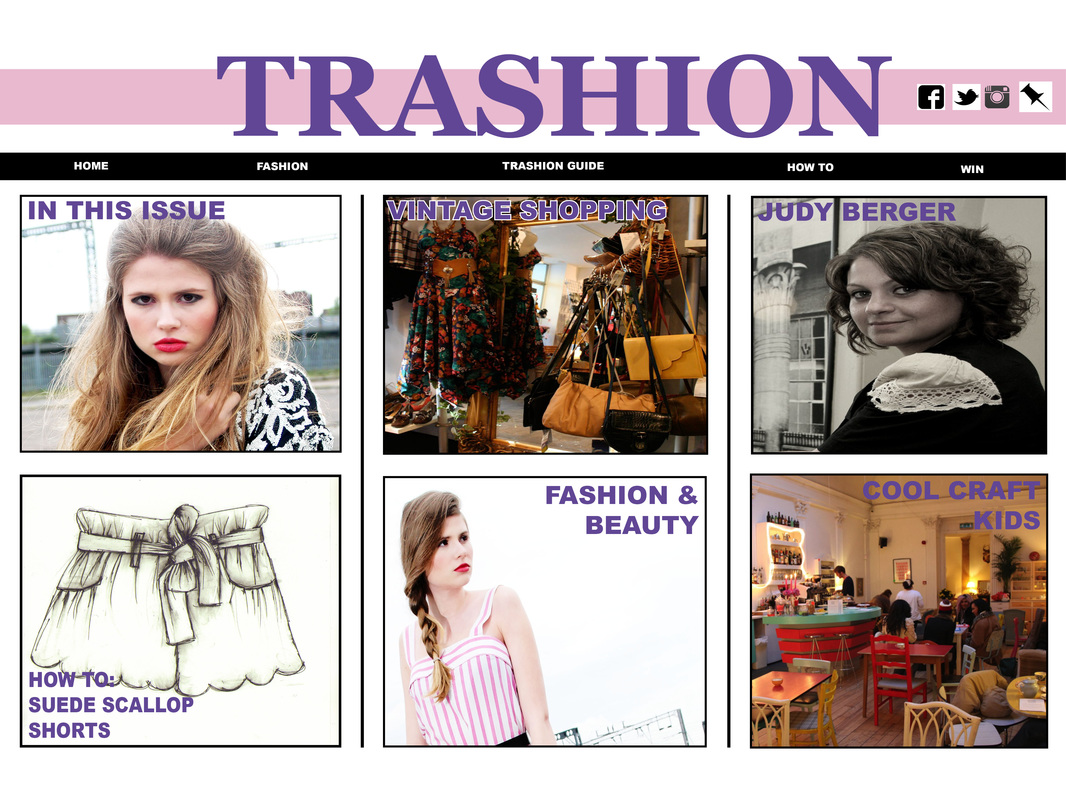
I was very pleased with the outcome of this version of the website's homepage so decided to stick with it. And here is the original final product that I initially set out to keep and my final edited version:

|
|
It is visible to see that there has been a massive improvement between my initial and edited webpage mock-up, there is a lot more structure in terms of how everything is positioned within the page hence giving it a more professional look. In this case, it has taught me that within the design process how crucial and important it is to prior research as it gives one an idea of what looks appealing and helps in making the final outcome look professional.
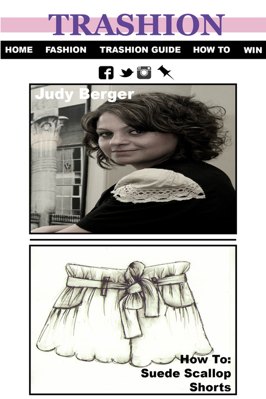
I then went onto creating the page with the exemplar article, which was pretty easy to do as all I had to was group all the objects together from my final product- ungroup them, create space for the article by deleting certain items from the homepage and adding the article as well as the complementary image to go with it. And here is the final product:
I then went onto creating the page with the exemplar article, which was pretty easy to do as all I had to was group all the objects together from my final product- ungroup them, create space for the article by deleting certain items from the homepage and adding the article as well as the complementary image to go with it. And here is the final product:
iPhone and iPad Mock-Up Designs
Before creating my iPhone and iPad mock-ups, having learnt the importance of research, I undertook research into different fashion magazines and how they appear on the iPhone and iPad. Here are some of the images which I gathered from my research:
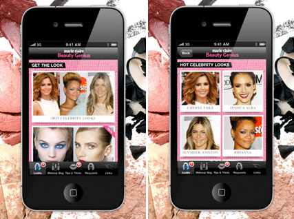
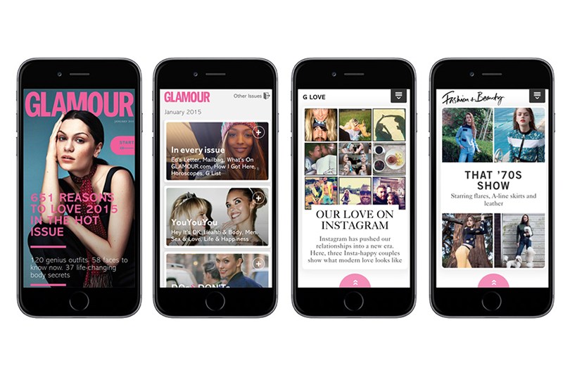
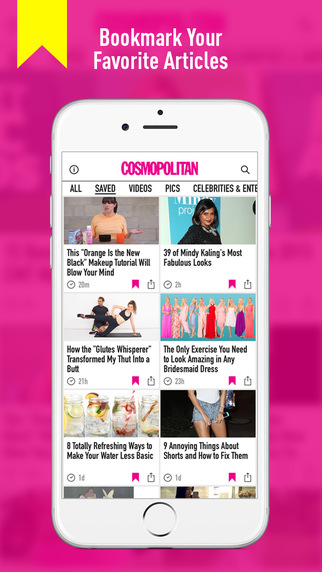


From my research undertaken, it was evident that the magazines on the iPhone and iPad appear to be image-heavy as opposed to content-heavy and I am assuming that this is due to the lack of screen space that both devices provide therefore designers have to make the website more eye catching to attractive audience's attention quicker. With this in mind, I decided to take this approach to creating my mock-ups as well. I went ahead and created some sketches from my iPhone and iPad mock-up designs before starting the process of creating them on InDesign:
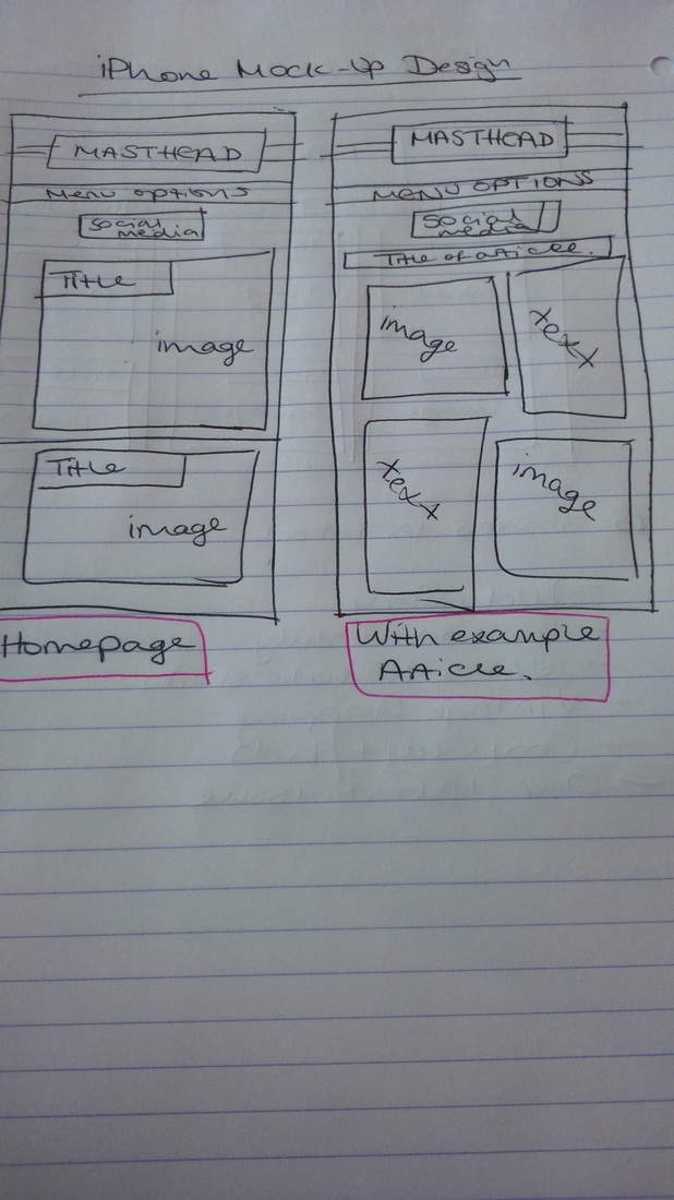
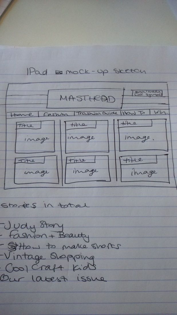
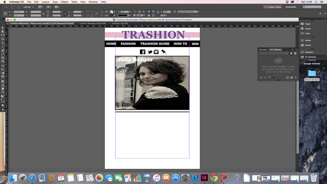
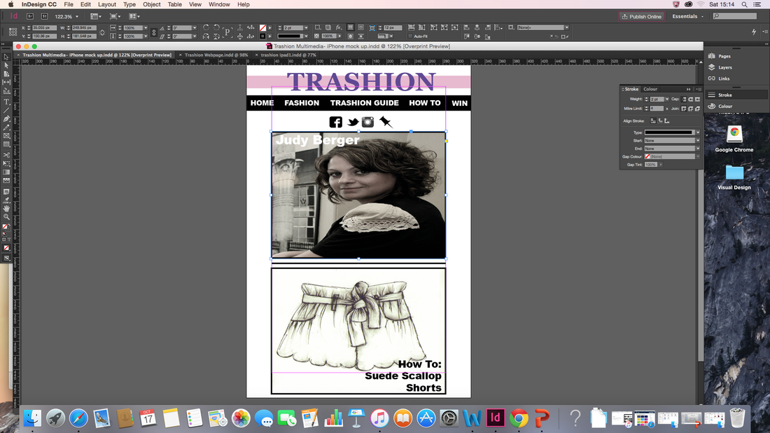
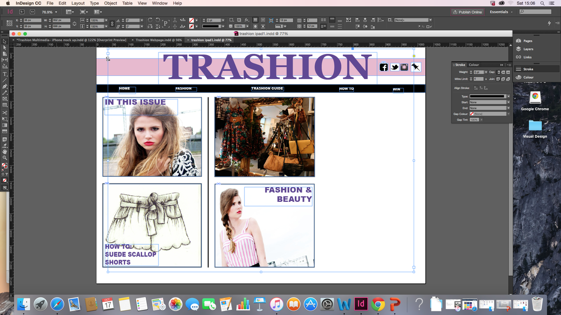
iPhone & iPad Mock Up Design- The Process
Below are screenshots which show the different stages which were taken to create the mock ups for both the iPhone & iPad.
iPhone:
Below are screenshots which show the different stages which were taken to create the mock ups for both the iPhone & iPad.
iPhone:
iPad:

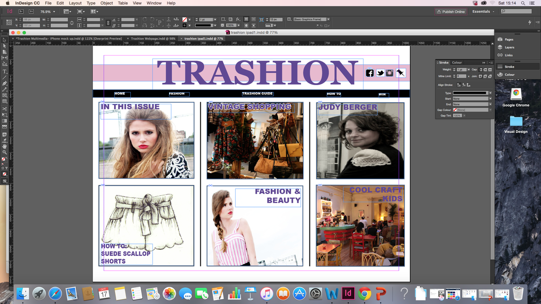
I was very pleased with the outcome of both my iPhone and iPad mock-ups so decided that no further amendments needed to be taken.
Here are the final designs of both my iPhone & iPad mock-up designs:
Here are the final designs of both my iPhone & iPad mock-up designs:
Week 8: Marketing In a Day
After creating the print edition of Trashion magazine and its multimedia outlets, the next task was create promotional material that would be used as a means of promoting the magazine and reaching the magazine's target audience which are females aged 18-30 years old which is inclusive of students, mature teens and graduates.
The promotional materials which I decided to create were:
-Poster (which could be doubled up as a Billboard)
-Bag
-T-shirt
I chose these promotional materials as they can be widely seen by the target audience. In addition, I thought it'd be a good idea to have a magazine launch party were well known beauty, fashion & hair bloggers/vloggers could attend and then receive free goody packs which will include some of the promotional materials as well as other items that would complement the event.
Poster
For the poster & billboard, it was important that it was eye catching so it would appeal to the target audience most importantly- but also other people as well. In addition, Trashion is a fashion magazine so I still wanted the poster for the launch to follow some of the codes & conventions of a fashion magazine.
Below is the final design of my Trashion magazine launch poster:
Brief Evaluation of MED4110
At the beginning of deciding to undertake this module with no supervision, my technical knowledge of Visual Design was very little and unknown and I had no previous experience with using Adobe InDesign so I was very concerned as to how I would learn how to use it in a short space of time.
However, I was willing to learn and figured that it would only add to my own personal skills especially as I want to get into Journalism and software like Adobe InDesign is one which Journalists tend to use. The module helped me to understand the importance of visual design, helped me to think about specific details that go into visual design more and also help me to be more creative when it comes to creating content. The activities such as the different case studies, looking for different examples of Visual design in my local area and writing about it detail was something that was not too hard for me to do as I am quite good at drawing out meanings from texts and discussing what different things could represent. However, my favourite part about undertaking this module was creating the Trashion magazine. As someone who hadn't used InDesign before, I was quite proud of myself for working my way around using the software and understand how to use for different effects and in the end the final product for the front cover and the example article came out pretty good.
I did when doing the various activities have a setback where I had technical difficulties so therefore had to start my work from scratch so the content that is shown throughout my learning diary was done within the space of two days however this does show that I can think on my feet and create decent quality work even if it is in a short space of time.
From this experience, I do believe that I have acquired the basic skills of using InDesign and will definitely experience with the software more in future to perfect the basic skills that I have gained.
